Elements in a market graph
Looking at the graph screenshot again, most relevant elements have been marked with numbers:
~1~
1) As discussed above, this button lets switch between graph and table format.
2) This selector (“Time”) lets select the time frame for the graph and table. By properly setting up the time frame we may gather additional information, the most useful settings range from Year down to 3 months.
The “Right click graph to configure filters” option next to “Time” is also useful but beyond the scope of an introducing tutorial. Most of the time the graph is good as is, you might want to disable some features in case some market manipulators put in fake orders to make the graph become a thin horizontal line (to hide their activity).
3) and 4) The red and green lines / curves on the graph are labelled respectively as 5 and 20 days simple moving averages (SMAs). A moving average is a so called “lagging indicator”. Its points are plotted by calculating the prices average of N days in the past. 5 days moving average means 5 days were considered in the computation. They are called “simple” because they are based on a basic average.
More advanced moving averages involve applying a bigger importance (weight) on the last few days, by using exponential averaging and other. EvE only comes with the simple kind (the least powerful). Moving averages are called “lagging indicators” because, since they are based on past days prices, they lag behind the current price action.
What a moving average does is to smooth the price variations so that you may see the price motions in a simpler way, like a game of “connect the dots with a line”.
Multiple moving averages have different “speeds”, a general rule of thumb of “ancient” technical analysis is to buy when the red (5 SMA) crosses the green (20) SMA from below and sell when the red SMA crosses the green SMA from above. But remember, those are ancient advices used decades ago. They still work sometimes in EvE because its markets behave like old markets but it’s no way a reliable way to trade.
The only more or less reliable way to trade with moving averages has been explained in the first part of the old forums first part of Experiment #01: RL finance analysis applied to EvE.
5) Donchian channel is another ancient lagging indicator. It somewhat helps determining whether the price is pushing up or not.
6) Median Day Price represents the median (not the average!) of the trades prices day after day. It’s the “yellow dots” that form the price graph.
7) This is the price graph with all the elements: the daily sequence of yellow dots representing the prices median superimposed by Donchian channel and moving averages.
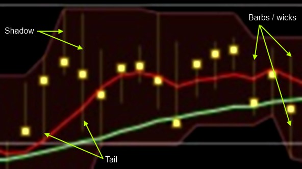
There are also some other very important elements: above and below each price dot, there are two very thin “barbs” or “wicks”. They represent the minimum and maximum for the prices of that day and are a very useful and not lagging instrument to “see” the market sentiment and the amount of buyers and sellers in any given day.
As shown by the picture below, the barb sitting above the yellow price dot is called “shadow”, the one sitting below is called “tail”. It’s possible for some sessions to show just one of those or even none.

8) Price levels. These lines are automatically calculated and rescaled. Sometimes they help, since some traders place buy and sell orders in their proximity, some times they don’t and only add to confusion.
9) Volume. This is another non lagging indicator that may help determine whether a price increase is due to true demand or is just a speculative bubble ready to burst and crash. Volume also indirectly helps determining whether a market is liquid or not. If it is, it will tend to be smoother and speculations will be harder to setup. Markets with just a couple of items traded a day are dangerous!
Comments