Daily chart
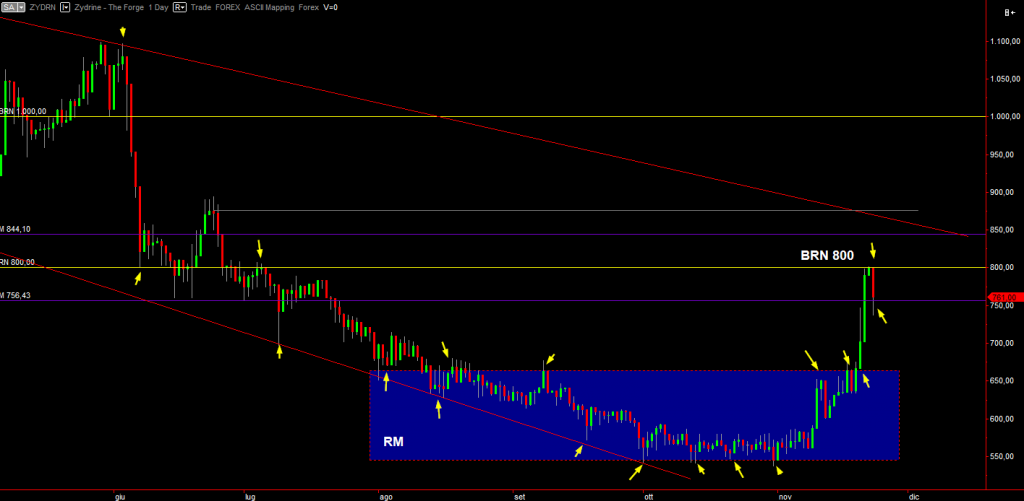
~1~The daily chart shows some interactions between price and other market structures. At first price slowly went down, supported by the lower red trend line. Look at the lots of small arrows showing how price reacted every time it hit the trend line. That’s the definition of (dynamic) support at its finest.
Then price described a range market (RM), in blue and recently broke it upwards. Arrows show the contact points. A problem with price beaking so hard is that it enters a so called “hyperbolic phase”, that is, it rises a lot but with no real solid foundations. This is typical of bubbles. Big rise with no foundation and then a crash. Therefore unless you are in the market already, it’s very, very dangerous to enter at the current price. It’d be better to wait for the monthly bar to close and see if it closed above the 756.43 monthly level.
Price trend frailty immediately got shown as it hit BRN 800. Price had not formed any swing to gain energy and thus it easily got beaten by sellers into submission. However after being pushed down, it still closed above the monthly level. Since it’s close to the BRN, price will tend to bounce between the two, forming “battle bars”, like dojis, spinning tops and similar. This means, entering here is not advisable. Assuming price will go up there, the next relatively safe place where to buy (after price putting a confirmation too) is above the swing connected by a grey line. It will also get rid of the upper trend line at the same time. It will still be well worse than having bought at the blue RM though.
