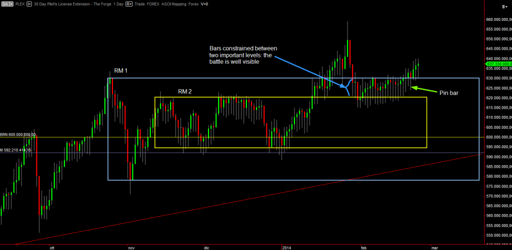
Daily chart
~1~The daily chart shows the current price activity. We have a larger Range Market (RM1) that encloses a smaller one (RM2). Since their supports and resistances are close, they effectively form a “trader death zone” exactly like Real Life markets. In fact price reacts to those close levels by oscillating (ranging) a lot and thus forming a tight RM where whoever buys or sells is going to see bad profits or even losses. Price recently broke out of RM1 and put a pin bar. Notice how unlike the chart above, this pin bar is a proper one. It’s a bullish pin bar because it sits in a mini swing low after a bullish bar.
However looking at the bars before it, they don’t form an higher high. The weekly bar too does not give safety, it closes above the blue RM1 but without letting bars go and take liquidity back down to RM1’s resistance.
TLDR: it’s too late and dangerous to buy for now. If price dips back to RM1’s resistance also on the weekly chart, then buying stock it’s somewhat less riskier. A better scenario would be for price to dip to RM1’s support. Then it’d meet the extra powerful yearly trend line in confluence with RM1’s support itself.

Comments